Canva: Quick UX Fix
Hand up if you love Canva as much as I do ✋!
There are many, many benefits to this app - especially on mobile. Canva successfully delivers a simple, user-friendly DIY design experience to its average user, no high-end tech knowledge required. There’s one thing that Canva is still missing however - on desktop specifically…
Let’s take a look at the two images below:
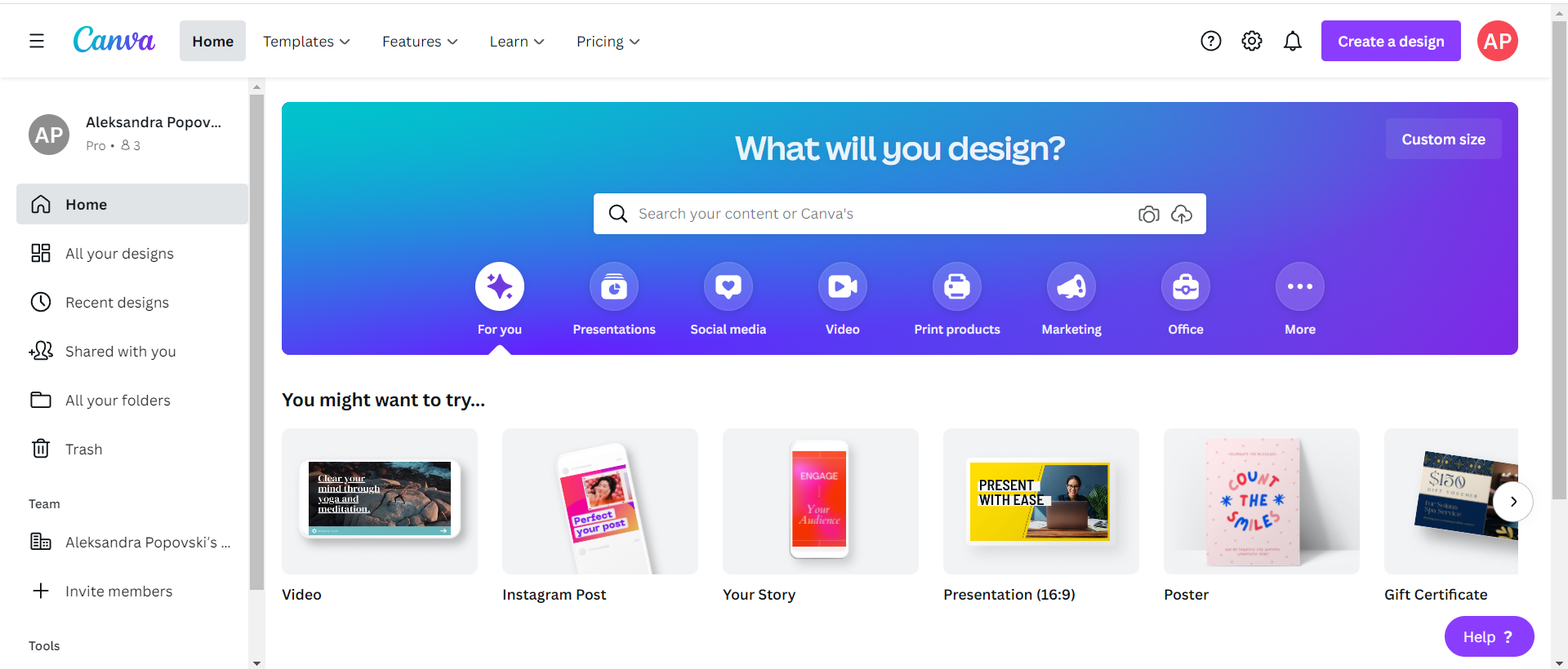
Canva Home Dashboard
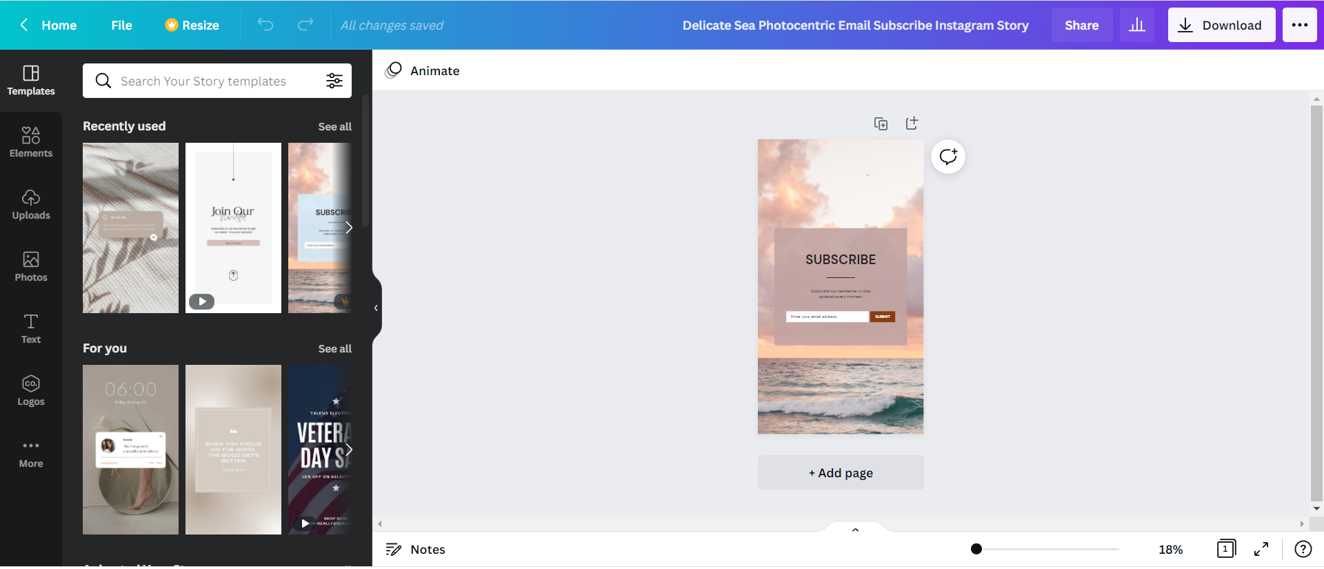
Canva Design Dashboard
The first image - Canva’s homepage dashboard, allows the user to select a template or one of the designs they’ve been recently working on. The second image shows a selected template and their design dashboard. Looks great, and easy to use - just one problem.
Let’s say you changed your mind about the template - and I’ve done this plenty of times - when you hit the back button, Canva doesn’t revert you back to the template feed you were looking through, it sends you back to the Home dashboard.
Here is the main problem with this:
It does not address the issue of users feeling frustrated when their mechanical, subconscious expectations are to go back to the screen they came from… which is what they will do, instinctively.
The alternative solution Canva offers to this problem:
Opening templates in a new browser tab, so that you don’t actually exit/lose the templates you were browsing through.
This is great, however it doesn’t solve the user’s instinctual gesture of clicking on the back button. When they do they are met with a disappointment in expectation, leaving them slightly disoriented, followed by selecting from at least two Canva tabs, which can in itself cause confusion.
So, my question to you, the reader, is - should we accept this as a solution to the problem?