ARK & PADDLE
Ark & Paddle was established as a consulting service geared for non-profits and start-ups to “improve their organizational capacity and community impact”.
The brand goals were to be disruptive, non-traditional and trustworthy.
Originally centred around the student union structure, which also typically adopts their branding to be aligned with the corresponding academic institution, Ark & Paddle wanted their goals as a non-traditional service to maintain the same standards of loyalty and trust while remaining relevant to students today. The same type of in-house counsel model also translates well to other non-profits and start up businesses looking to strengthen their organizational roots.
Ark & Paddle’s brand identity started from ground zero. The name that would be chosen needed to provide a feeling of security, imply an idea of moving forward and continuity all while evoking leadership, strength, guidance and ties to the Canadian land, an homage to the roots of the true north.
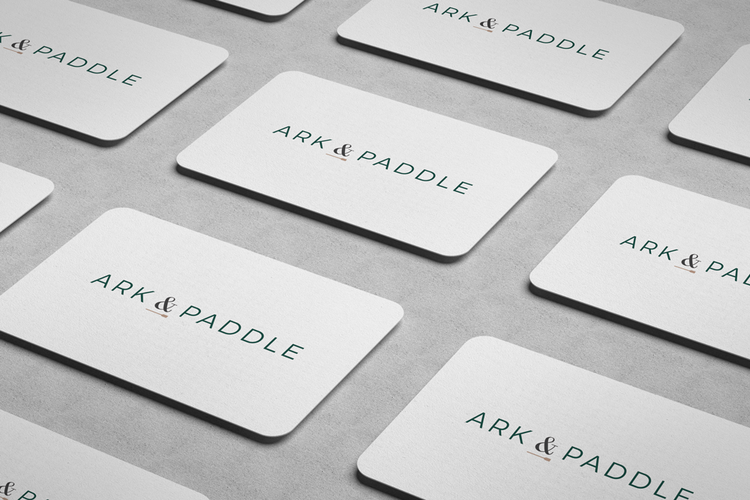
Logo Design

The type and visual elements needed to also elude to its earthy origin without compromising a timeless feel. As a brand, ARK & PADDLE should appeal to various types of clientele, from the corporate sector and to startups and small businesses.The pairing of classic and modern typefaces achieved this successfully.
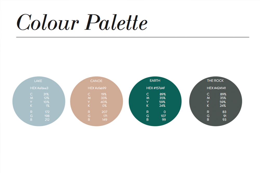
Since Ark & Paddle’s brand identity pays tribute to the land, the brand colour palette needed to evoke the same spirit. Dark green and grey contrast a muted brown and blue to make up the A&P brand palette.
The colours also reflect reliability and trust all while maintaining a non-traditional, non-corporate expectation of the consulting brand.
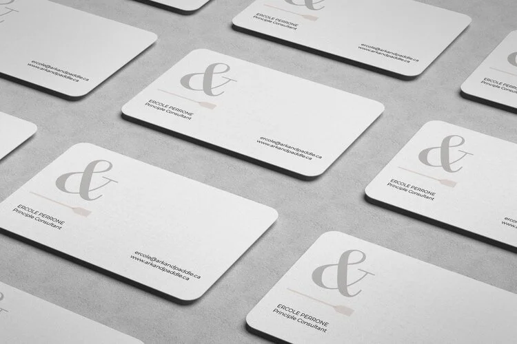
Brand Gallery