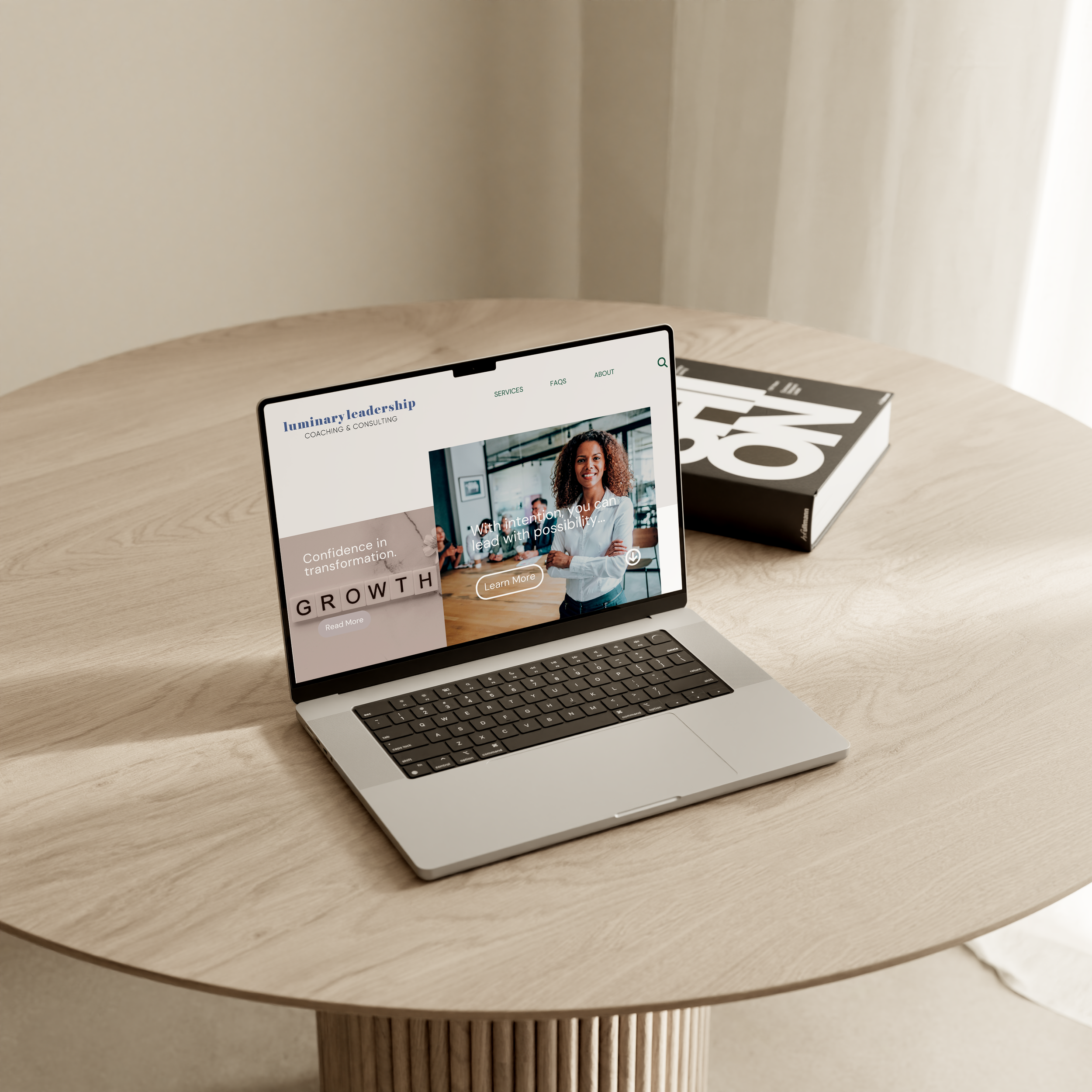
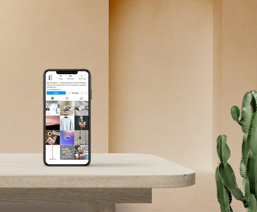
Luminary Leadership
Luminary Leadership is a coaching and consulting business that helps individuals and teams navigate life transitions.
My client originally had two separate businesses, one in coaching and the other in consulting.
They came to me with a vision of seamlessly merging both into one.
Luminary Leadership Coaching and Consulting
The client’s brand goals were to evoke an effortless tone and style, to ensure the perception reflected their reputation:
reliable
value
integrity
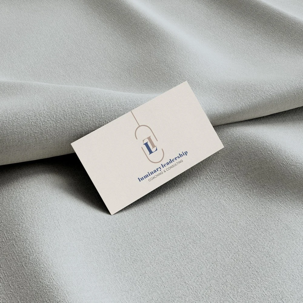
Colour Palette:
Soft Taupe, Mid Blue & Royal Navy
The client’s brand goals stated possibility, disruption and expandability. This is where our colour palette comes in. The blue and nude tones convey a balance of trust and reliability along with comfort and stability - all of which are important for maintaining a coaching brand and business.
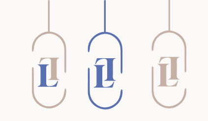
Type Pairings
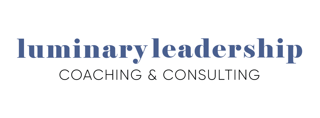
A bold serif typeface with a modern sans-serif once again reflects a timeless design without compromising brand integrity. It aids in the brand standing out, we’re not looking for minimalism here, but a brand that remains true to itself.
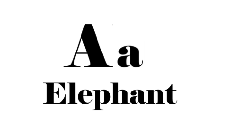
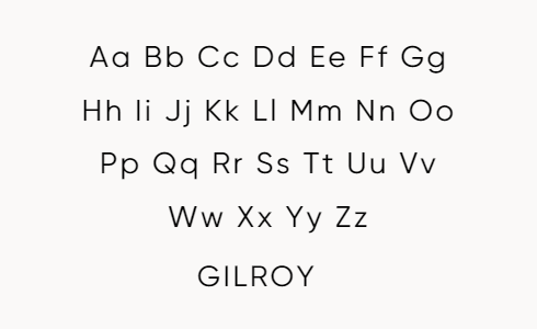
We chose Elephant as the primary logo typeface along with Gilroy as a secondary typeface. Gilroy can also be used for paragraph and body text alongside additional typefaces conveying a similar aesthetic.
Brand Gallery