Experience Design… but in the Kitchen. Let’s make it relatable.
Did the headline catch your eye? Good, it should have! I know what you’re thinking but at some point as you’re scrolling you’ll have your “Aha!” moment.
Go ahead, keep reading… I’ll wait for it :).
Simply put, we are creatures of habit. This is part of why experience design is so important. It can literally impact our daily lives and how efficiently we function. Our entire lifestyle functionality as humans depends on user experience design. Especially today.
Think about your kitchen for a second. For example - you put certain utensils and appliances in specific spots depending on how often you access them and how you use them. Simple right? Well, yes. And no.
I’ve been in my house for five years now and my kitchen is still not optimized to its fullest potential. Largely due to the fact that my journey, as a user of my kitchen, has changed several times since having moved in. Most recently, just before my second baby was due, I reorganized and decluttered my kitchen cabinets by taking tips from The Home Edit, Ikea and Pinterest blogs. I have an average size space, no pantry and not too much storage.
I thought I did a great job, especially on how much stuff I realized actually fit in my cabinets when thoughtfully arranged. It took a slight habitual adjustment, but I very quickly gravitated to my new method, which validated that I had optimized my morning routine, that was very, very task-oriented. I’m sure that’s the case for most of you. Fast forward to four months later to April, a few weeks after my son was born and me finding my bearings, the user flow of my reorganized kitchen no longer worked at its fullest potential.
With a baby usually hanging off of one hand, I find myself accessing a lot of day-to-day items with the other hand. This makes prioritizing readily used items in relation to the upper drawer storage space extremely essential.
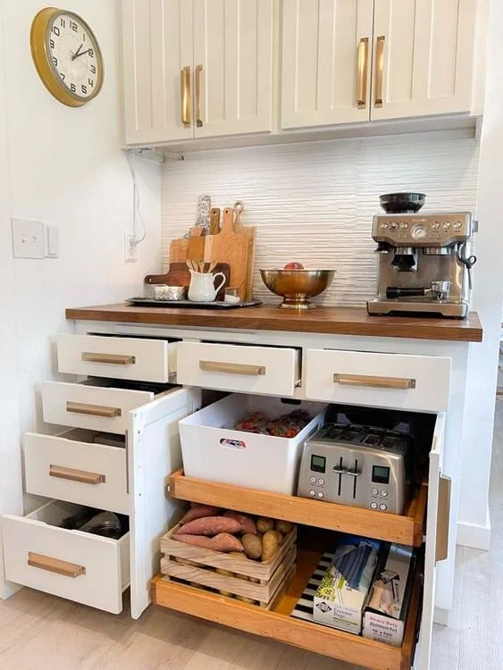
Image of kitchen drawers. Pinterest 2021.
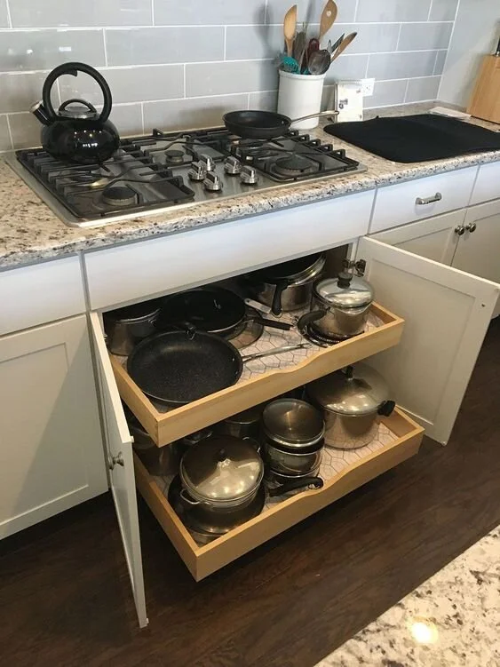
Image of pot and pan drawers. Pinterest 2021.
Psych…neither of these is my kitchen… Pinterest has some really great inspiration photos. Although I’m sure both you and I can easily point out some non-functional placements of some of these items. But neither of these organization tactics were designed for our day-to-day needs.
So how is this related to DIGITAL UX?
Well you see, your users function the same way. If your website’s most wanted assets, whether that be your best selling products, the services you want to promote, login page retrieval, etc., are NOT easy to access or use, especially when requiring multiple steps. You’re in grave, grave danger of user frustration. Think about how many times you get annoyed when you can’t find your sharpest knife…or in my case, digging out the milk foamer from the dish rack to warm up my daughter’s bed time milk - yes, you read that right, I prefer to have one less appliance on my counter top - after about five seconds of searching, you either evidently show your frustration or give up.
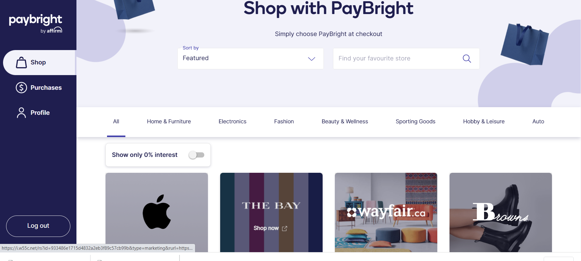
Check out Paybright’s user profile dashboard. This is one thing they got right in terms of simplicity and achieving the goal of helping user’s spend money easier. The grid layout with merchant options makes is super easy to focus on the goal of just straight-up shopping.
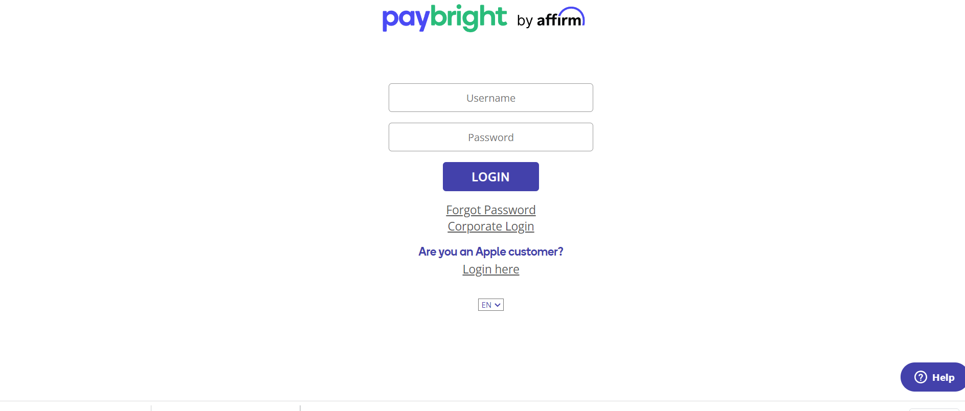
Looks simple but this example is the opposite of easy. Considering Paybright usually sends numeric pins to the accountholder’s mobile number…what the accountholder’s username and password should be is unclear. It brings into question user frustration and questioning whether the user landed on the right page. When trying to login into an account, the process should be as simple as possible. Period.
These are nearly irreversible mistakes when it comes to your users. So next time you think about your site design or your client’s… think about you and your wayfinding around your kitchen while cooking dinner.
Remember, as good looking as your design is, it ain’t worth sh*t if you didn’t factor in usability.