Tips for choosing a website builder with UX in mind
Everyone can be a web designer these days...have you noticed?
With a multitude of web platforms to choose from that provide ready to publish templates and drag and drop editors that make it as easy as possible to create your own website, you don’t need to hire a professional, right?
Sure, you can DIY anything. However, value is measured by perspective. While entirely understandable that small businesses typically do not have the budget to hire UX consultants or web designers to create an experience that will acquire them loyal customers, the majority of DIYers do not see the value in UX, likely because of not understanding its impact on the customer. There also appears to be a common pattern when going the DIY route - functionality is overlooked and the focus on making the website design pretty takes centre stage.
And we can’t even throw blame! The majority of website builders draw their users in with beautiful imagery on ready-to-go templates and slogans that read “Create a website in 30 minutes!”. Sounds damn appealing, doesn’t it?
So here’s a few pointers to help you keep user experience in mind:
Usability: Either WIX or Squarespace
Is the editor easy? Can you easily find how to upload an image? Or change your colour palette? Or add a text block or image gallery to your page?
Have you considered breaking up your content with images and text so that it doesn’t overwhelm your users (customers or clients)?
How big is the learning curve? If you have to spend more time learning the basics of how to use the platform than actually creating, maybe it’s not the right choice.
Consider the goals you set for your users. What do you want or need them to do while they're on your site? Buy a product? Sign up to your newsletter? Focus on making those goals as easy to achieve as possible and not just on good looking design.
Hint! This site was designed with Squarespace :)
Accessibility: Wix or Squarespace
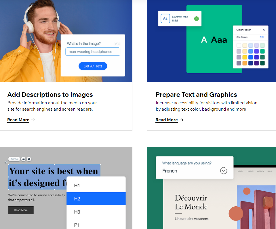
Does the platform have accessibility tutorials? WIX has pretty in-depth and easy to follow accessibility guides.
Make sure to use text hierarchy such as H1, H2, H3 for your text. It’s already done for you!
Unless you’re a blog or your page is an article, consider breaking up long paragraphs into sections, use the hierarchy headings and insert images to help readability.
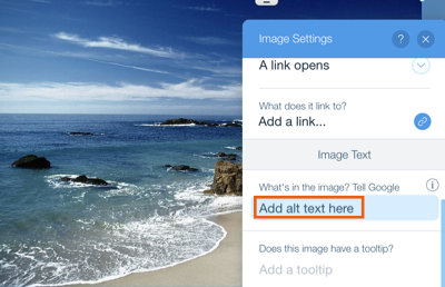
Make sure to add ALT TEXT to your images. This is especially important for screen readers, but also benefits your SEO.
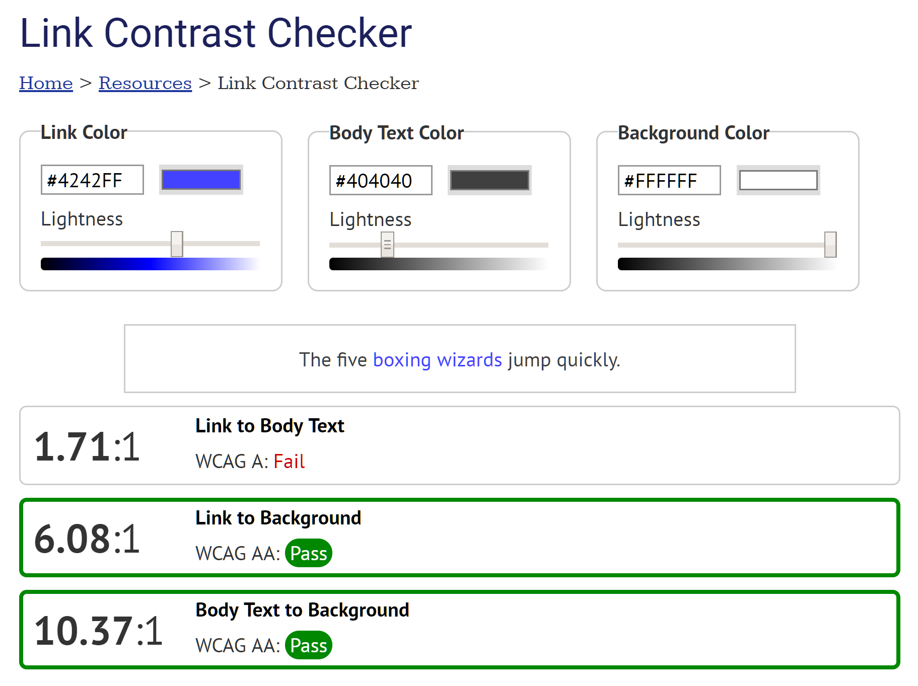
Consider colour contrast. This is the number one mistake most DIY web creators make. White text on a beige background may be the trend but it’s definitely not popular. Run your colours hex codes through a colour checker site to make sure it passes the ratio test!
Typefaces are important. Don’t get too fancy with fonts. Only use decorative typefaces for super short headlines. And make sure that whatever you choose is legible. Especially for long text.
Do not forget to check the mobile version of your site. Both Wix and Squarespace have mobile responsive templates so be sure to double check that your images and text are optimized for mobile AND desktop.
Alt text, tags, meta descriptions and page descriptions all have an impact on your SEO optimization. Sound overwhelming? That’s because it’s not easy to stay on top of it.
Although on the more pricey side, SHOPIFY is your
number one option for an ecommerce platform.
Automated emails (Sign up confirmation, order received, order shipped)
Intuitive product filtering
Shipping capabilities and integration
Sign Up banners and pop ups
Product recommendations
Main menu navigation categories
Product tags and keywords
Ecommerce: SHOPIFY
Do you need to create an online store?
Here are a few things to consider:
Your inventory size
Payment provider options and security
Product descriptions and titles
High quality images
Seamless and easy checkout experience


